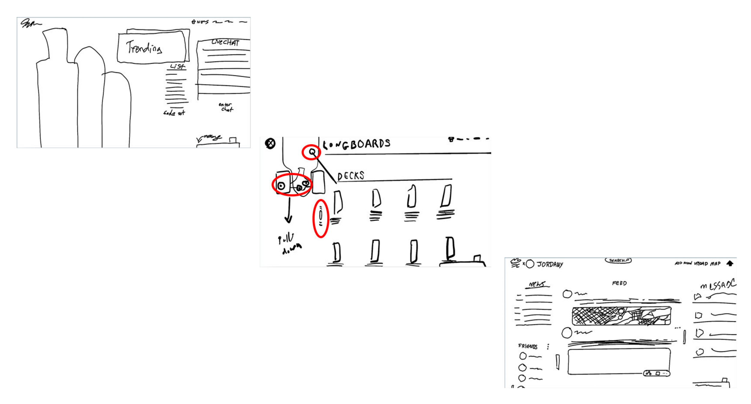
I created thumbnail sketches of each page and layed out the navigation as well as element placement.
Page one needs to show viewers all the main aspects of the site. The social hub, shop, and newsfeed should all be part of the layout.
this is the shop page. It allows users to customize their boards and accessories.
The third page will be the social hub where users can create an account and discuss with one another, create events, ect.
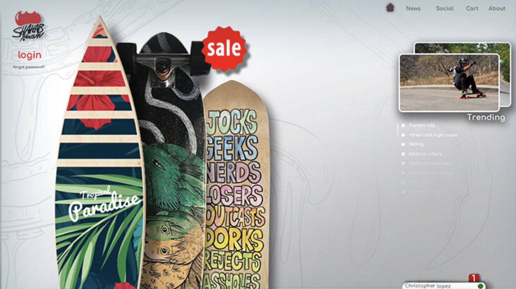
1st Rendition
Why the change?
The first rendition of the website incorporated everything needed however lacked structure and a theme. I decided to make some changes, revamping the fresh feeling.
-
The home page lacked a stable layout and felt all over. It needed a more modern and sectioned look to make it coherent.
-
Most skate cites lack a proper cart. Each board requires different parts, the new cart will section off each part, mimicking a to-do list.
-
The social media section incorporated too much screen information. It needed to be more calming on the eyes.


